Group Project work
I have unfortunately neglected my blog throughout the group project so I'm going to post up my contribution to the group project
Character design -
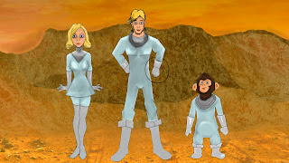
Just the final idea for our 3 daring Astronauts
Modelling-
I Modelled the following scenes
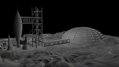
Moon Station
The Walkway was the part I had trouble modelling with a help from Justin's texturing the scene was brought to life. Minor changes to the set up of this initial idea is the elevator shaft being sideon in the actual animation.
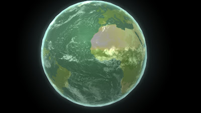
Earth
Not much to model just a sphere with an Earth texture. Over the top is an atmospheric sphere and over the top of that is the cloud layer which was set to a low transparency to view the ground below. The green tint is to give the impression of a slightly unnatural Earth to fit with our story.
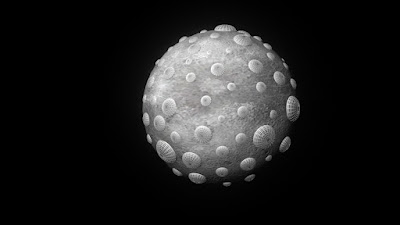
Moon
Similar story for the moon, a sphere with a craterous moon texture over the top. This was then populated with the domes.
Aeroplane
Using Orthographic images I found of a passenger plane I began to model the plane in order for it to be broken up and put into a scene.
Sleep Capsules
For the sleep capsules we liked the design of the Alien Hypersleep capsules but liked the Lost In Space idea of the characters being upright rather than laying down. The capsules are based off the Alien design.
The crashed plane scene
This scene I put together, UVing the plane and texturing it. I animated the characters for the trailer however due to pacing it had to be cut down to make sure we didn't lose any of the trailers momentum. I learnt a lot from this scene in terms of animating and rendering especially. Justin really knows his stuff when it comes to rendering and he definitely strengthened my knowledge of mental ray and passes in the animation, I'm really pleased as to how the renders turned out.
Promotional
Using the characters and our scenes I created some promotional images. Posing the characters in different ways for the shots such as above and then also similar for the DVD Cover and Image
I had a little dabble with After Effects with the studio logo which features at the beginning of the animation, mainly using the mask tool to hide the sun until a certain point.
And finally some business cards put together to promote our studio
Our final trailer
After the 15-18 weeks of work I have learnt so much and had such an enjoyable experience. Thanks to Justin and Sasha who have made it enjoyable due to the easygoing nature and I think I have definitely learnt a lot, especially in terms of Maya modelling, texturing and rendering. I'm really pleased with the outcome of this project and I am raring to go for the transcription project.
Character design -
Just the final idea for our 3 daring Astronauts
Modelling-
I Modelled the following scenes
Moon Station
The Walkway was the part I had trouble modelling with a help from Justin's texturing the scene was brought to life. Minor changes to the set up of this initial idea is the elevator shaft being sideon in the actual animation.
Earth
Not much to model just a sphere with an Earth texture. Over the top is an atmospheric sphere and over the top of that is the cloud layer which was set to a low transparency to view the ground below. The green tint is to give the impression of a slightly unnatural Earth to fit with our story.
Moon
Similar story for the moon, a sphere with a craterous moon texture over the top. This was then populated with the domes.
Aeroplane
Using Orthographic images I found of a passenger plane I began to model the plane in order for it to be broken up and put into a scene.
Sleep Capsules
The crashed plane scene
This scene I put together, UVing the plane and texturing it. I animated the characters for the trailer however due to pacing it had to be cut down to make sure we didn't lose any of the trailers momentum. I learnt a lot from this scene in terms of animating and rendering especially. Justin really knows his stuff when it comes to rendering and he definitely strengthened my knowledge of mental ray and passes in the animation, I'm really pleased as to how the renders turned out.
Promotional
Using the characters and our scenes I created some promotional images. Posing the characters in different ways for the shots such as above and then also similar for the DVD Cover and Image
I had a little dabble with After Effects with the studio logo which features at the beginning of the animation, mainly using the mask tool to hide the sun until a certain point.
And finally some business cards put together to promote our studio
Our final trailer
After the 15-18 weeks of work I have learnt so much and had such an enjoyable experience. Thanks to Justin and Sasha who have made it enjoyable due to the easygoing nature and I think I have definitely learnt a lot, especially in terms of Maya modelling, texturing and rendering. I'm really pleased with the outcome of this project and I am raring to go for the transcription project.


It looks really great Max, you guys should be proud :D
ReplyDeleteThank you Lyn-Dae :D
ReplyDelete